OpenBook
A crypto tokenomics platform rebuilt for clarity. Real-time data APIs, Webflow architecture, and information design that makes complex financial data feel like a conversation with a sharper analyst. 8 weeks.
What We Delivered
The Situation
You have eight tabs open. Token launch data on one. On-chain distribution analytics on another. Market maker wallet activity in a third. A spreadsheet you built yourself because nothing exports in a format that actually works. The window for acting on this is not waiting for you to finish assembling the picture.
This is not an edge case. This is Tuesday afternoon for every serious crypto analyst who has not built their own tools.
-
Fragmented data, no unified view
Every serious analytical question about a token requires data from multiple sources. Token launches, supply distribution, wallet activity, market maker behaviour. None of it lives in one place. All of it is required to form a coherent view.
-
No analytical logic in existing tools
DEX screeners answer what is trading. On-chain platforms answer where the supply sits. Market maker trackers answer who provides liquidity. None of them answer the question a real analyst is actually asking: is this token worth paying attention to, and what does the full picture look like?
-
Trust problem in crypto dashboards
In a market saturated with low-quality dashboards, visual quality and information accuracy are the primary trust signals. A platform that looks assembled from a template communicates something about the depth of what sits behind it.
The data existed everywhere. The picture existed nowhere. OpenBook was built to replace eight tabs with one view that thinks like the analyst using it.
The Approach
Phase 1
Analytical Workflow Research
Before a wireframe existed, Empyreal invested in understanding exactly what a crypto analyst does when they assess a new token. What they look at first. What they cross-reference. What visual representations they find useful versus misleading. Where the current toolset creates friction that costs them decisions.
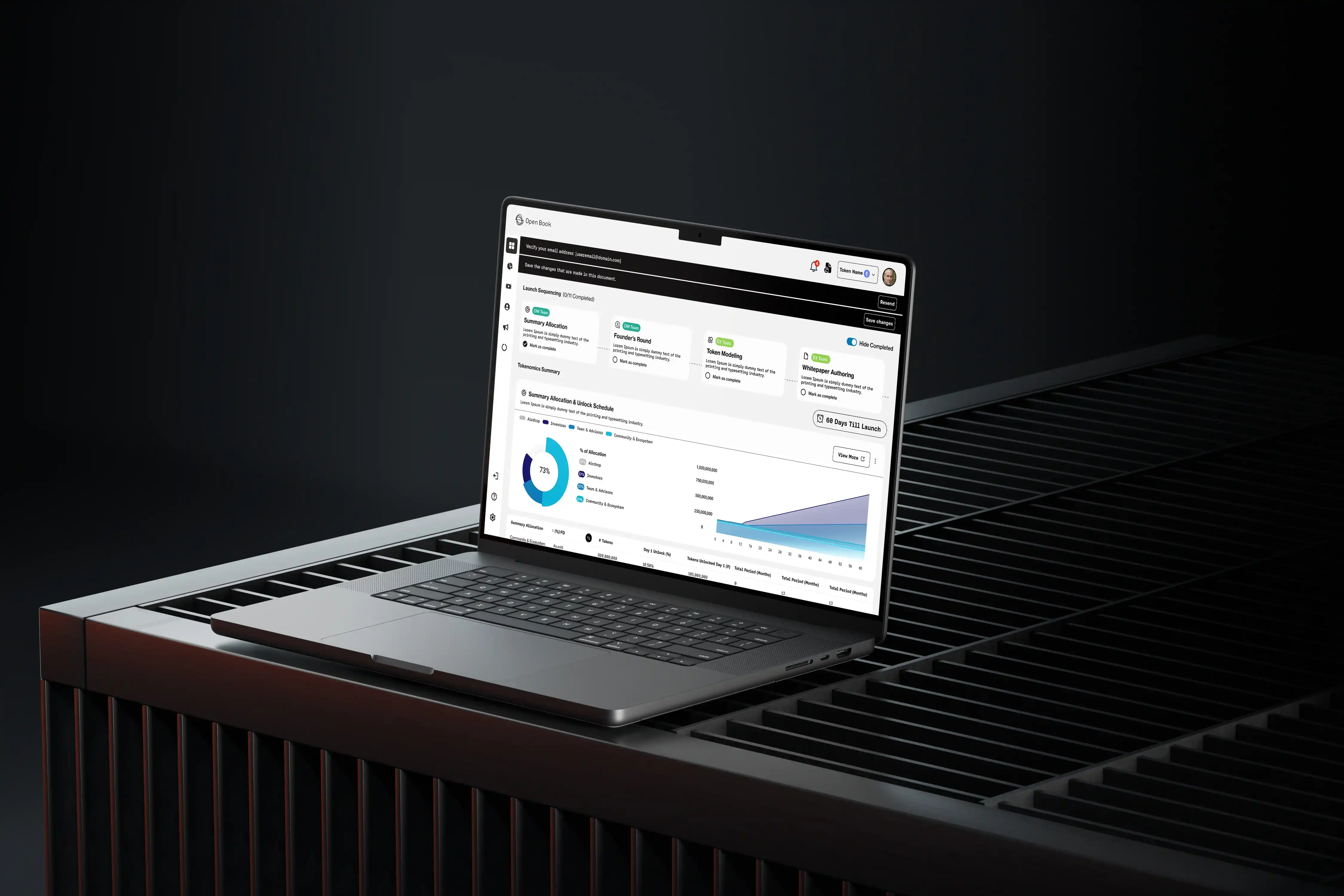
Analyst journey mappingThe research revealed that analysts do not consume data simultaneously. They orient first, then investigate, then cross-reference. The OpenBook interface was structured to support that sequence rather than flatten it into a single overwhelming screen.
Data hierarchy designKey design questions resolved before pixels: How should token distribution be displayed to make concentration risk visible at a glance, not after calculation? How should market maker activity be surfaced so wallet behaviour patterns are distinguishable from noise?
Progressive disclosure architectureExperienced analysts see depth immediately. Newer users see context first, with pathways to deeper data. The platform speaks to both without either feeling the experience was built for the other.
Most agencies design the interface and add the data. Empyreal designed the analysis and built the interface around it.Phase 2
Webflow Development and Real-Time Integration
Webflow for the frontend, delivering the design quality that makes a serious crypto analyst feel the platform is worth their attention. Real-time crypto data APIs for the data layer, selected around analytical use cases rather than data availability.
API integration designed around use casesThe question was not "what data can we pull?" It was "what data does an analyst need, in what format, at what update frequency, to serve the specific views the platform delivers?" That distinction changes every integration decision. In one platform, the data makes the interface work. In the other, the interface works around the data's limitations.
Token distribution visualisationThe hardest design problem. A pie chart of wallet distribution can obscure concentration risk behind visually equivalent slices. A raw table requires mental arithmetic. The visualisation approach surfaced distribution patterns distinctively, so an analyst could feel the structural health of a token before reading a single number.
Market maker activity displayThe line between healthy liquidity provision and price manipulation is not always visually obvious in raw transaction data. The interface presented behaviour patterns an experienced analyst could read quickly, without oversimplifying for less experienced users in a way that might mislead.
Performance optimisationData-heavy pages optimised for speed. In crypto, a slow dashboard loses users to faster competitors. Every millisecond of load time sounds like an invitation to open a different tab.
The Numbers
The token that might have taken twenty minutes to assess across multiple platforms can now be assessed in a fraction of that time, with higher confidence, because the relationship between data points is visible in the interface rather than inferred through manual assembly.
Mohit's Take
"The hardest decision was resisting the urge to show everything at once. Crypto platforms default to data density as a credibility signal. But density without hierarchy is noise. We spent more time on what to show first than on the data integration itself. The token distribution visualisation went through multiple iterations. Early versions were technically correct but did not make the analytical signal visible at a glance. We kept pushing until an analyst could feel concentration risk before reading a number. That is the difference between displaying data and designing analysis."
— Mohit Ramani, Founder & Lead Architect, Empyreal Infotech
Tech Stack
The toolchain behind the OpenBook platform.
Start a Conversation About Your Product
You are sitting on a data problem that has a product solution. The question is whether the team you build with will understand the domain well enough to design the interface that actually serves the people who will use it, or whether you will spend months building a dashboard that looks right and thinks poorly.
A discovery call with Empyreal is thirty minutes. You describe the analytical workflows your platform needs to support. Empyreal listens, asks the questions about your users that change the architecture, and tells you honestly what the build requires.