Fortune Fried Chicken
A restaurant digital presence built to make visitors hungry before they read the menu. Brand energy, food photography architecture, and location accessibility across every touchpoint. Webflow, WordPress. 3 months.
What We Delivered
The Situation
Fortune Fried Chicken had the food. The flavour. The personality. The queue at the counter. What they did not have was an online presence that carried any of that energy to the person deciding where to eat tonight.
-
Brand energy lost in translation
The restaurant had personality and quality that customers experienced viscerally. The online presence communicated neither. A brand that makes you salivate in person and feel nothing online is losing customers who search before they visit.
-
Menu as experience, not just information
Food photography and menu architecture needed to make visitors hungry, not just informed. A menu that lists items and prices is a spreadsheet. A menu that makes you imagine the taste is a conversion tool.
-
Location accessibility across touchpoints
Multiple ways for customers to find, visit, and order. Directions, delivery links, contact options. Each one present at the moment the visitor decides to act, not buried in a footer.
The food was the product. The website needed to make people want to taste it before they could.
The Approach
Phase 1
Brand Energy and Visual Strategy
Design started from the sensory experience of the restaurant itself. The sizzle. The colour. The energy of a busy kitchen. The platform needed to carry that visceral energy digitally.
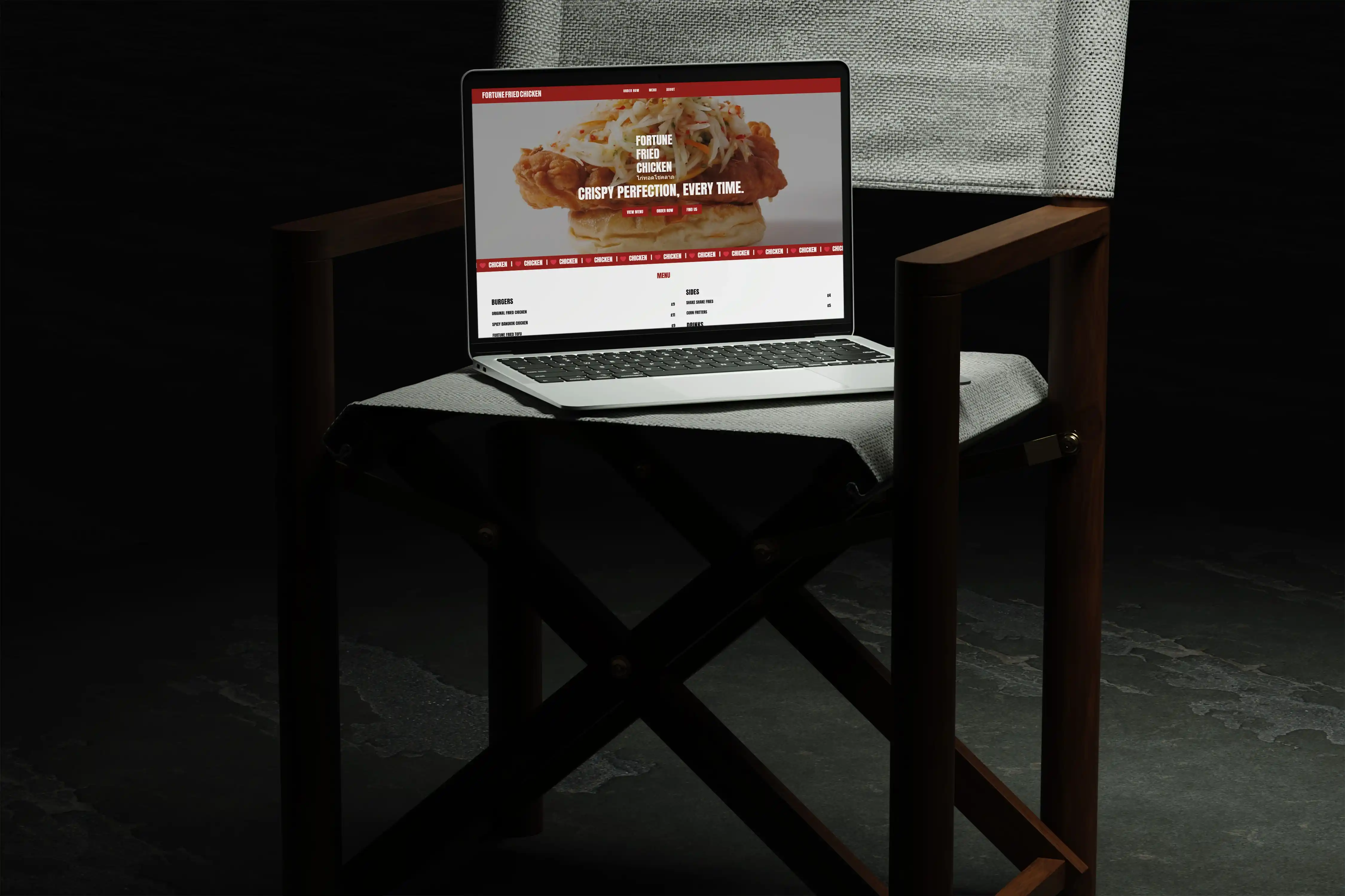
Food-first visual hierarchyPhotography and layout designed so the food dominates every viewport. Generous images. Warm lighting. Close-up textures that make the screen feel warm. The visitor's first experience should be hunger, not information.
Brand personality in every interactionThe voice, the colour palette, the typography, the micro-interactions. Each carrying the same energy a customer feels walking through the door. Bold without being aggressive. Playful without being unserious. Confident because the food backs it up.
Menu architecture for cravingMenu presentation structured to create desire, not just communicate availability. Categories that tell a flavour story. Descriptions that make you imagine the bite. Photography paired with every signature item so the eyes do the selling.
Phase 2
Webflow and WordPress Build
Webflow for the primary site experience. WordPress for content management and ongoing updates.
Webflow for visual impactThe design quality that makes food photography sing. Fast loading, mobile-responsive, and visually striking on the screen sizes people actually use when deciding where to eat tonight. That decision often happens on a phone, in the car, hungry.
WordPress for operational flexibilityMenu updates, location changes, hours, promotions. The Fortune Fried Chicken team manages all of it without developer involvement. A restaurant website that cannot update its menu quickly serves the wrong hours and the wrong specials.
Location and ordering integrationDirections, delivery platform links, and contact options positioned at the decision points where visitors are ready to act. Not in a contact page they have to find. In the flow, where the craving meets the convenience.
The Numbers
Fortune Fried Chicken launched with a digital presence that carries the same energy as the restaurant. The visitor who discovers the website hungry leaves hungrier, with the directions already loading.
Mohit's Take
"What does the visitor need to feel in the first ten seconds? For Fortune Fried Chicken, the answer was hunger. Not 'this looks like a nice restaurant.' Hunger. That distinction shaped every design decision. The photography size. The colour warmth. The menu layout. We tested whether the website made us want to eat there, not whether it communicated information correctly. Both matter. But in a restaurant website, the craving comes first. The information serves it."
— Mohit Ramani, Founder & Lead Architect, Empyreal Infotech
Tech Stack
The toolchain behind the Fortune Fried Chicken website.
Start a Conversation About Your Product
You have a restaurant where the food speaks for itself in person. The question is whether your online presence carries that same energy to the person deciding where to eat tonight on their phone, in the car, already hungry.
A discovery call with Empyreal is thirty minutes. You describe the restaurant. Empyreal listens, and tells you honestly what it would take to build a digital presence that makes visitors hungry before they read the menu.